
Character Concept Art Portfolio
(Clicking on an image will full-screen it for better readability)
Battle Academia Gwen
Fan concept art of a Battle Academia Gwen skin for League of Legends. Battle Academia is a pre-existing skin line in a universe where champions go to schools that cultivate the next generation of superheroes. The Battle Academia series is inspired by shonen anime and manga like My Hero Academia and Kill la Kill. Gwen is a second-year student and member of the Assassination Club at Durandal Academy. As a reject of the Academy’s popular cliques herself, Gwen stands up for the students who are bullied, rejected, or nonconforming. Her unwavering optimism combined with a pair of deadly scissors are a powerful combo for defending the Academy’s outcasts.
Finished Concept Pg. 1
For this concept, I wanted to portray Gwen as a rebellious student who uses her combat skills to fight against the bullies preying on weaker students. I still wanted to maintain her ‘protector of good’ trope and cheery nature from her original lore. While Gwen is part of the Assassin’s Club, the only club allowed to kill their opponents in duels, she shows mercy to those who value life and have good in their soul.
Orthographics 1 w/ Weapon

Finished Concept Pg. 2
I decided to express her rebellious nature through a lot of her outfit choices: she still wears the school skirt (which is larger to match her original model) and bomber jacket that reps the academy crest, but she wears darker makeup and adorns her shoulder pads, shoes, wrists, and even weapon with metal spikes. The open midriff and mismatched knee-high socks also make her distinct from other students.
Orthographics 2 w/ Doll Asset and Eye Details


During the initial costume exploration, I explored different high school tropes that Gwen might fit into: cheerleader, emo/goth, goody two-shoes, teacher’s pet. I also experimented with color as a way of complementing these tropes. Ultimately, I went with the emo/goth ‘reject’ trope, as it was a nice tie-in to her original lore as an animated doll with a human soul who fights the undead- a rather gothic theme.
Designing her weapon was the most challenging part for me. To fit with her rebellious nature and costume, I wanted the weapon to be spiky and dangerous-looking. Being giant scissors, there was no denying the influence of Kill la Kill when I was designing it. The two sides of the scissors are different colors (an homage to Kill la Kill) but combine together to become a cohesive weapon.
When it came to color, I chose a split-complementary color scheme of blues and greens with a pop of pink/magenta. The turquoise blues and greens are a nod to Gwen’s original color scheme. Her hair and eyes are the only warm color in her design, highlighting her head as a focal point and also matching with Battle Academia’s theme of colorful hair. In both her costume and weapon design, I researched existing Battle Academia skins to make sure the shape language and color hierarchies were cohesive with the official series.
Cyrus, the Sunforged
Splash art and concept art for Cyrus, the Sunforge- a fan project for a new League of Legends champion. A Solarian forge master, Cyrus’ zealous worship of the sun allows him to manifest weapons made of pure sunlight. As a member of the Ra’Horak, a group of Elite Solari warriors, he practices his craft and hones his battle skills at his sanctuary close to Mount Targon’s summit. In the game, Cyrus can channel his devotion to reforge his weapon into a slow but overwhelming great axe, a versatile longsword, or an agile pair of daggers, each altering his attack range, mobility, and abilities.
The splash art was the final culmination of the character and environment concept art for Cyrus. Not only did I want to illustrate his magical solar powers and uber-focused personality, I also wanted to illustrate his Solari background and the environment he lives in. Undisturbed by the harsh cold, he is shown manifesting his longsword, pointing it towards the viewer with an unwavering and stern expression. He is definitely not someone you want to bother!
Finished Splash

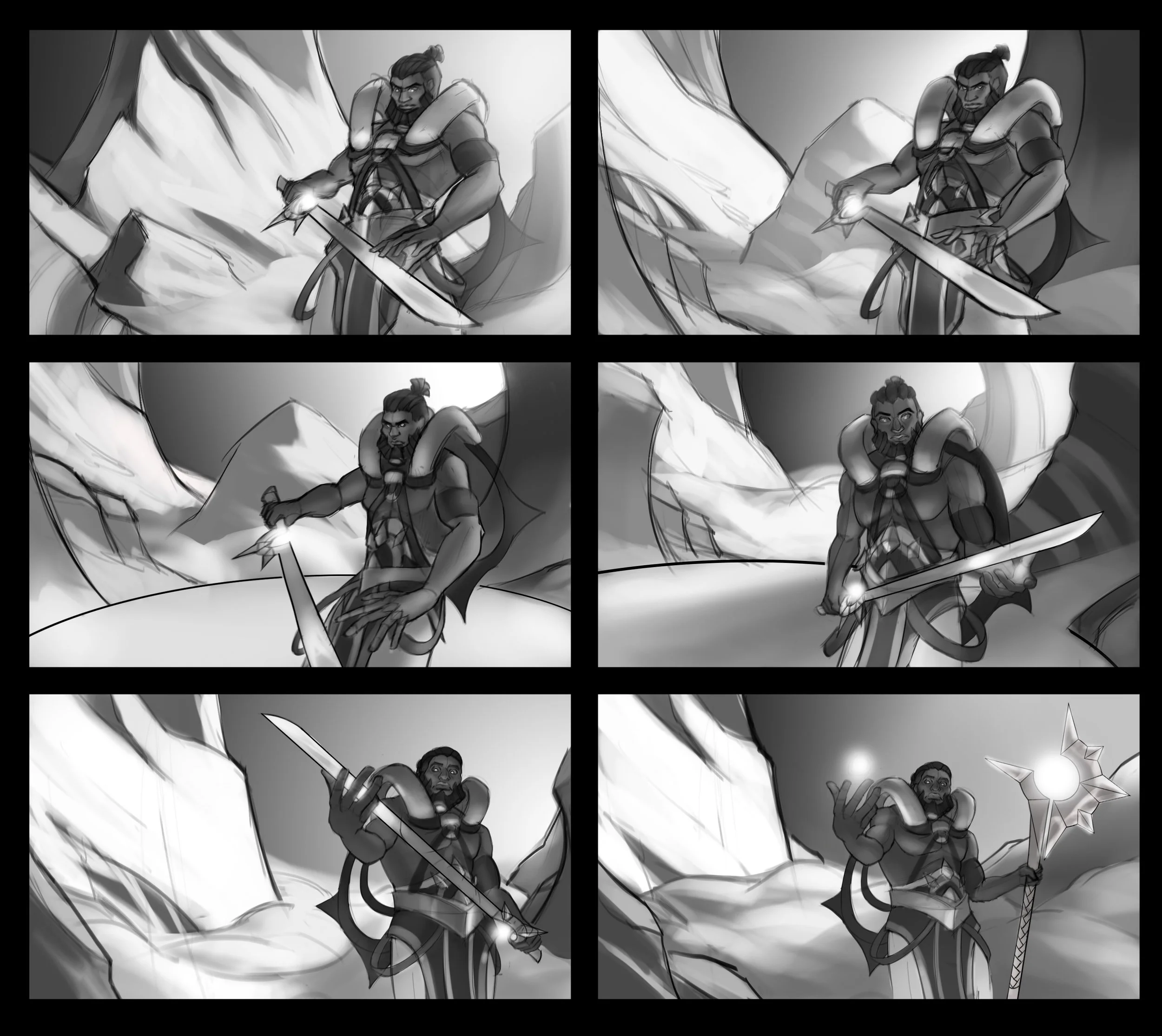
Orthographics


In early exploration, the initial idea for Cyrus was “a zealous blacksmith who makes magic weapons and fights in the name of their deity/nation.” Wanting to ground my character in the world of League of Legends, I researched the different established nations and their ideals. I decided to narrow my scope towards the nations of Noxus, a military-centric empire focused on expansion by any means possible, or Solari, a religious order who devote their lives to praising the Sun as the source of all life. Sketches 2 and 3 were a more focused exploration on Noxian design- rigid, utilitarian, geometric; Sketch 1 was Solarian design- sun motifs, flowing, ceremonial. When exploring faces and hairstyles, I also wanted to communicate they were from those specific nations.
Ultimately, I decided Cyrus was going to be a Solari blacksmith devoted to his work and prayer of the Sun. His face is stern and resolute, and the shaved sides, short ponytail, and well-kept beard fit with an intensely focused blacksmith warrior, as he doesn’t want his hair to get in the way of anything. As a blacksmith and a warrior, he has a muscular, stocky, and hardened body from his work. I wanted to emphasize his back and forearms, as he carries and swings a lot of weight around when working/fighting. His outfit gives him freedom of movement when forging, praying, or fighting. His armor and his tattoos also act as ceremonial garb, with various sun motifs showing his devotion.
Prop Sheet
Prop/VFX Concepts


When designing Cyrus’ weapons, I explored a variety of shapes and designs of weapons from around the world. I wanted to make sure the weapons would read as a Solari weapon, so including sun motifs- spiked arcs, circular designs- was vital to the design. I decided on three weapons to represent three different playstyles: a slow but heavy hitter, a balanced style of speed and power, and an agile but less potent style. My final designs were a great axe, a longsword, and a pair of daggers, each representing one of these playstyles.
In the final prop sheet, I included versions of each weapon as they are being formed. Each weapon radiates outward from the star/orb, and the silhouette of the weapon turns into a gold metal as it hardens. I also did some concepts for Cyrus’ abilities. I wanted his abilities to illustrate that his powers are solely from his weapons, and in turn, the Sun itself. Yellowish energy arcs from the weapons and Cyrus himself, similar to a solar flare, when the ability is cast. Spiked rays are emitted outward like the rays of the Sun.
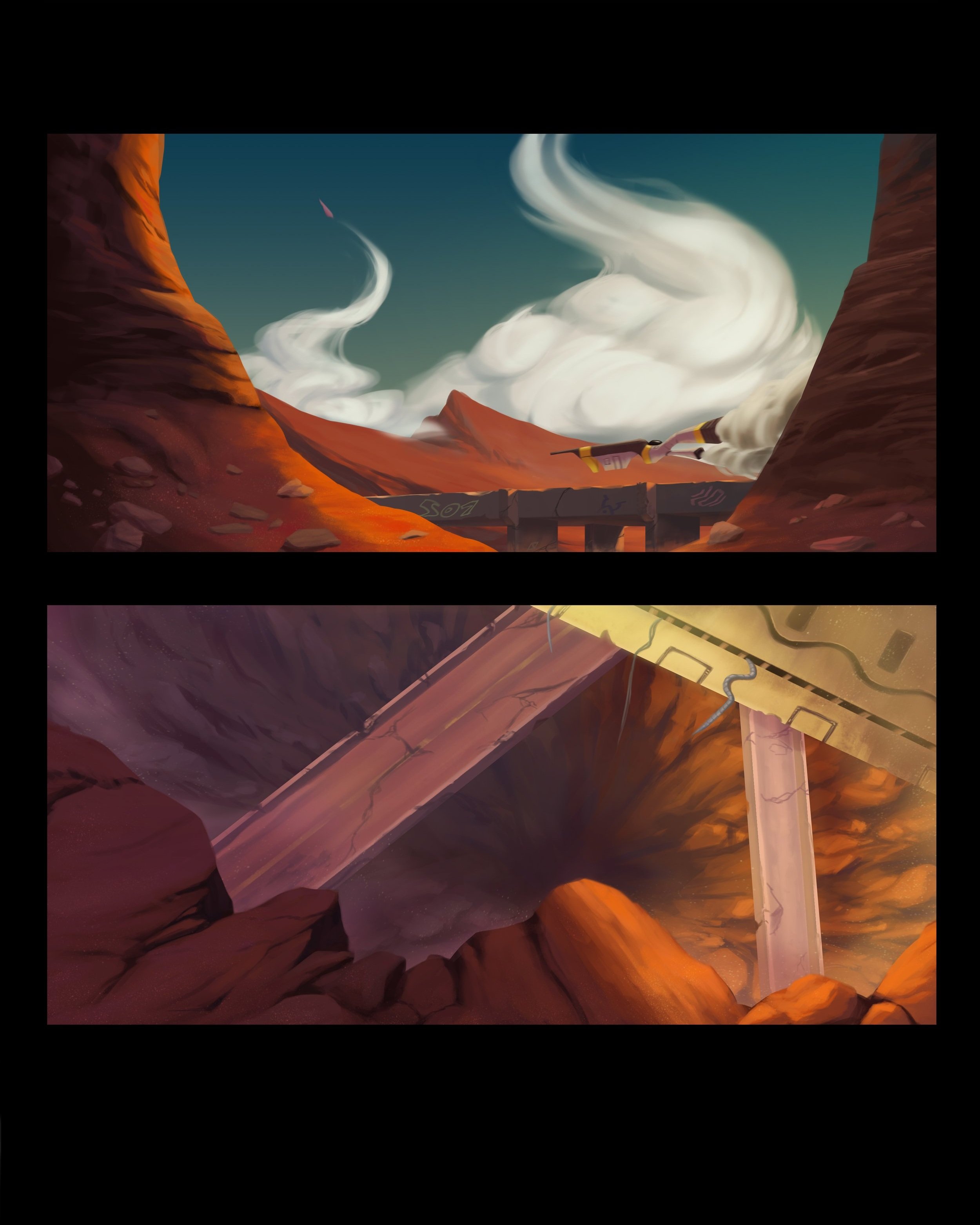
Finished Environment


Cyrus’ Sanctuary, atop the mountains next to Mount Targon. Being elevated above the clouds and surrounded by snow, I wanted the sanctuary to be in direct sunlight and show that Cyrus is unaffected by the harsh cold of this environment. During my thumbnail phase, I took a lot of reference from official environment concept art of Mount Targon, mimicking the various circular and arcing patterns in the rock formations and even the aurora in the sky. The pattern of the sanctuary’s main platform is based off of official art of a Solari temple. In my color comps, I played with different times of day, and decided to depict the scene at the end of a sunrise, as it would be a highlight the Sun’s importance and prominence in the environment.
Wanderer
Wanderer is a story about a wandering knight on an adventure to explore the secrets of magic around the world. Along his journey, he befriends a young Mycelian- a race of sentient fungus who live deep in the underground Hollows. After months of traveling, the two naïve adventurers discover an ancient library still standing, sequestered within the colorful Runic Forest. The pair excitedly survey the treasure trove of arcane knowledge, when suddenly, the knight opens a seemingly mundane book. Instead of words, a glowing portal appears from the pages, pulling the adventuring duo into it. They are dropped into a strange, barren world, and unknown to them, thousands of years into the future. As they traverse the sandy, abandoned highways, mysterious metal ships skirt across the horizon or launch precariously into the sky. In distant shadows lurks a witch doctor who foresaw this time-traveling duo, and plots to kidnap and study them. As the Witch Doctor sends his eldritch monstrosity of a henchman to hunt them down, the adventuring duo have a new threat to face in this post-apocalyptic world.


Keyframes exploring possible moments from the narrative of Wanderer. In my thumbnails, I explored different ways of illustrating the dynamic between the Wanderer and the Mycelian. While both are new to adventuring, the knight leads the two to their destination, both physically being the lead and also making constant notes of their journey. The Mycelian is the more naïve of the two, excited to explore the world above their home in the Hollows, but anxious about what could be out there.
When they enter the future, I wanted to convey a sense of danger and otherworldliness in this new environment. I explored different scenes in which the Henchman, a hulking eldritch creature, is stalking them throughout their exploration. I also wanted to show the Henchman’s servitude to the Witch Doctor, his master.
Finished Character Lineup


During early exploration, it was my goal to design characters that were unique and not completely from our world, but grounded enough to be relatable. A lot of my initial silhouettes were built upon random brush strokes. After refining the silhouettes that I liked the most, I decided on developing two protagonists and two antagonists, each being a strong contrast of the other in both physicality and personality. While the Wanderer is a proud and strong warrior, the Mycelian is a small and anxious pack mule. Likewise, the Witch Doctor is wise and willowy, while the Henchman is subservient and brawny.
When deciding on color scheme, I chose to use warm, earth tones for the Wanderer and the Mycelian to signify that they were from the same period of time. These colors also made them feel more welcoming and friendly as protagonists. The Witch Doctor and the Henchman have vibrant reds, oranges, and purples to emphasize the jarring difference between the protagonists and the antagonists, and similarly, the time periods they’re originally from. These colors and the patterns on their outfits were influenced by the clothing of indigenous African tribes. This choice was also made to signify how the Witch Doctor and the Henchman are long-lived natives to the environment that the protagonists get teleported to.


The Legend of Dorothy Pendragon
The Legend of Dorothy Pendragon (TLDP) is my reimagining of The Wizard of Oz (TWO) as an animated film for young adults. In TLDP, the world of TWO is meshed with the medieval English themes within the legends of King Arthur. Dorothy Pendragon is plucked from her world of luxury as the daughter of a wealthy lord, and dropped into the magical Land of Oz as a mere peasant girl. Landing in a town of goblins, she meets Glinda the Good, who leads her on the path to the Emerald Tower, where a wizard named Merlin is known to grant wishes. She ventures forth in a land unknown, making friends with Percival, a living training dummy (scarecrow); Escanor, a haunted suit of armor (tin man); and Lionell, a forest dragon (lion). The wishful team of misfits make their way to the Emerald Tower and find Merlin, who tasks them with killing Morgana the Wicked, a malicious witch tormenting and enslaving the residents of Oz. If they complete this task, Dorothy might be able to return to her home in 6th century England.


For the keyframes, I explored different compositions on two major plot points in the story:
1. Dorothy finds herself and parts of her castle scattered in a town of goblins. Instead of finding a pair of ruby slippers from the dead witch, Dorothy finds a large ruby sword in the rubble of her crashed castle. This is the start of her journey to escaping this mysterious Land of Oz.
2. Dorothy and her trio of friends finally make it to the Emerald Tower. They enter into the grand hall of the tower to confront Merlin, the Wizard of Oz (or a magical hologram of his head, at least).
I mostly experimented with different angles and framing of the characters, trying to express the moment of suspense and ‘epicness’ of each scene. I wanted the main focus of each keyframe, the Ruby Sword and Merlin, to be the clear focus, with both direct and indirect lines directing the viewer’s focus towards them. I also aimed to illustrate every character’s personality in these keyframes. Dorothy is in complete awe of the Ruby Sword, but curiously reaches outward to it. The bewildered goblin villagers all stare at her and the sword in shock. When meeting the intimidating head of Merlin, Escanor stoicly holds his ground while Percival innocently waves to him. Dorothy braces herself while Lionell bows his head.
Finished Character Lineup


When designing these characters, I tried to retain the essence of the original cast of The Wizard of Oz while changing their appearance to fit the King Arthur-medieval setting. I also wanted the style to be cartoony and playful to cater to a younger audience, as well as emphasize each character’s silhouette and personality. Dorothy has a smaller body and larger head, wielding a massive sword, showing her young age and her strength to carry onward. Percival has skinny limbs to convey his awkwardness. An arrow remains stuck in his back due to his lack of awareness. Escanor is top-heavy and hunched over, showing his sadness and hopelessness as one bad step could make him fall. Lionell has a large body and small wings, something he might be self-conscious about. His droopy ears and tucked-in head and tail show his shy and cowardly nature. Glinda’s long, elegant dress and fabric around her arms parallel her gracefulness and elegance as a benevolent witch.
Finished Prop/Environment Sheet. From Left to Right, Top to Bottom:
Morgana’s Staff, Sacred Heart, Shield of Valor, Scroll of Wisdom, Morgana’s Imp, Glinda’s Horse, Goblin Boat, Morgana’s Dungeon, Goblin Hut, Emerald Tower
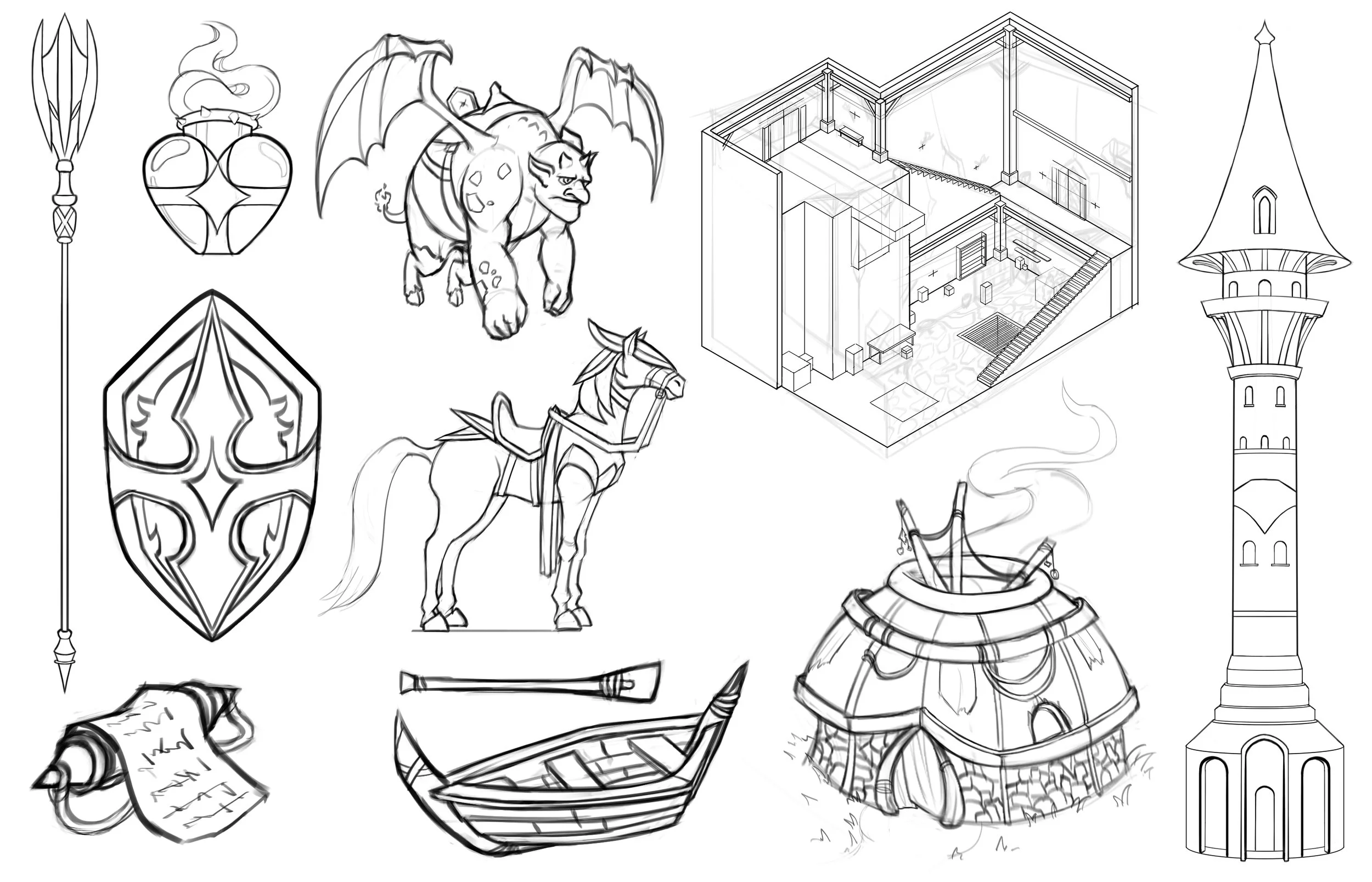


Some props, vehicles, and buildings for the world of TLDP. I wanted to flesh out the world a bit more by creating some of the interactable objects and environments in the narrative.


Some environments fleshing out the look of TLDP. In particular, the area surrounding the Emerald Tower as well as inside the tower were chosen, as it is a key setting in the plot. During early exploration, I wanted to evoke a sense of wonder in the environment, but also maintain readability and relatability to real life. I was inspired by the grassy hills and cliffs of England and Scotland when designing the land surrounding the Emerald Tower.
Kappa Yakuza
Finished Character Concept


The Sh3r1ff
Finished Character Concept and Expressions
Early Exploration and Color Comps